At KHL Design Studio, we build on a company’s brand so that their interior is an extension of who they are and how they want to be identified in the market. A strong brand begins with the basics that can take years to achieve. To start, finding the perfect color palette to compliment your business can make or break the company’s image. Color is often overlooked, yet 90% of a first impression is based on how someone is recognizing color. Everyone perceives color differently, but it can strongly influence mood, behavior, and awareness. Color Theory and Color Psychology are fields of study dedicated to how we interact with color.
Color Theory is the combination of color and the mixing of colors for specific visual effects. Creating a stunning palette starts with balancing qualities such as: Hue, Tint, Tone, Shade, and Temperature. Definitions:
Hue: Pure color and dominant color family - Red, Blue, Yellow, Orange, etc.
Tint: The Hue with only White added
Tone: The Hue with only Gray added
Shade: The Hue with only Black added
Temperature: Our perception of color as either being Warm or Cool
Color Psychology begins with breaking down each color on the color wheel. This starts with three main categories: primary, secondary, and tertiary.
Primary: Red, Blue, Yellow
Secondary: Orange, Purple, Green
Terirary: Made when you blend; Browns, Greys, Black
So what do certain colors evoke in us?
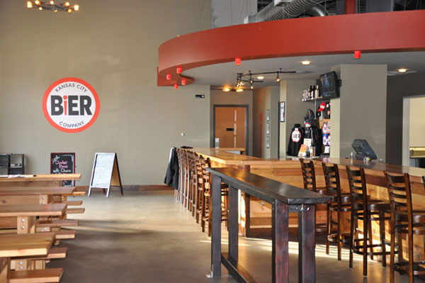
RED is a strong color that evokes passion and tension. Stimulates urgency! This is the reason why fast food and sale promotions are often red. The physical effects on the body include increasing blood pressure and heart rate. Red also sparks our appetites. Check out the KHL’s use of red at KC Bier Company in the popular Waldo neighborhood of Kansas City. From the logo to the interior palette, red was used for brand identity. The German influenced theme and modern look of their bar has become a local favorite amongst beer enthusiasts.
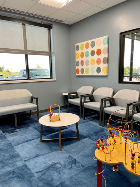
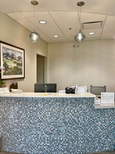
BLUE is another powerful color that most people associate with peace, security, and tranquility. It is often used by companies to gain client’s trust as it has calming characteristics. It’s also selected as most people’s favorite color, that’s impactful! College Park Family Care designed by KHL in Lenexa uses shades of blues to welcome their guests to their facility. is a common color found in healthcare and associated with nature and calming effects. Combining blue and green was a perfect palette in their pediatric care setting.
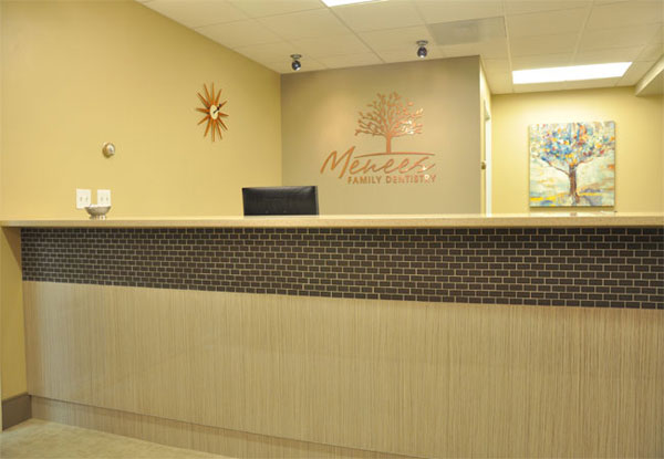
YELLOW is inspiring, uplifting and energetic. In corporate branding, it’s effective in showing clients that the brand is fun and friendly. Yellow comes second to red in food branding. This eye-capturing hue stands out among other choices, but it’s encouraged to add a complementary color. Prairie Village Family Dentist chose a warm hue for the overall color and incorporated blue and teal accents to promote a calming, yet inviting space.
GREEN is associated with nature and positivity, and can have a harmonizing effect. This calming color makes people feel safe while also resembling growth. Common businesses that often use green in their logo revolve around agriculture, landscaping, and solar power. Green is the second most favorite color by men after blue. College Park Family Care is a great example of the combination of these earth colors. Here, it makes sense their logo incorporates a green leaf for health.

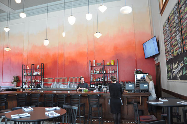
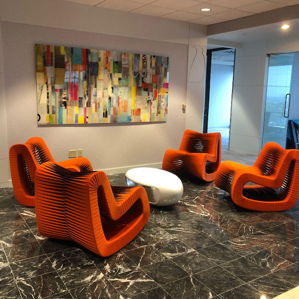
ORANGE is inviting and energetic. Over west in downtown Lawrence sits Merchant’s Pub & Plate. A warm, ombre wall of color is used as a focal point behind the bar. Orange is associated with confidence and enthusiasm. Although vibrant, it can have other condescending characteristics so it’s important to carefully consider the hue of orange. Jack Cooper’s Corporate Office in downtown Kansas City is another example of welcoming accents of orange into the color palette.
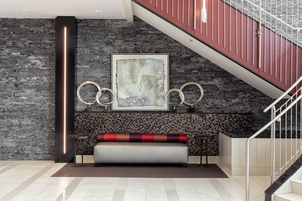
PURPLE is a mysterious color that is associated with royalty, magic, and spirituality. Creativity and imagination are tied to this color’s nature, but also negatively associated with arrogance and immaturity. However, this color is second favorite by women after blue. If contemplating including this color in a logo, then consider using a contrasting color such as yellow or gold along with it. Checkout this reception nook located at Sparhawk Laboratories’ corporate headquarters. The corporate colors (black, gray, and red) left room for a gradual shade of purple.